When it comes to interface design and creating a delightful user experience, one of the most impactful decisions you’ll make is color choice. Without a doubt, color is a core building block of any performant interface.
Creating a color scheme for a product might seem like a hard task, but in reality, it’s not as complicated as you may think. And there are quite a few tricks we can employ to create a great color scheme in no time.
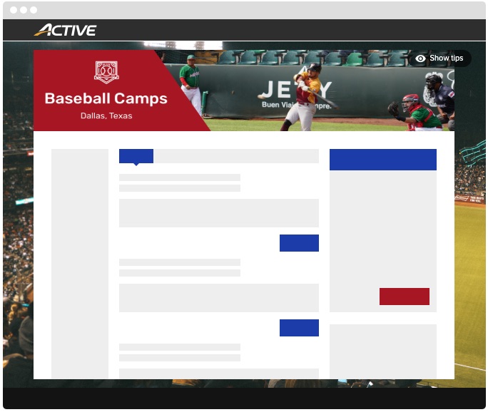
In this article, I’ll highlight how to take advantage of the new color customization feature in Camp and Class Manager to captivate your customers.

Staying On Brand
Let your brand colors guide your customization choices- this is your opportunity to imbue your checkout flow with the personality of your organization. Now, although you might be tempted to add a lot of color to your checkout pages, it’s best to keep the design simple. Your customers use these pages to enter participant and payment information for their orders, and you don’t want to distract them or make the information hard to read.

Choosing an Aesthetic Color Palette
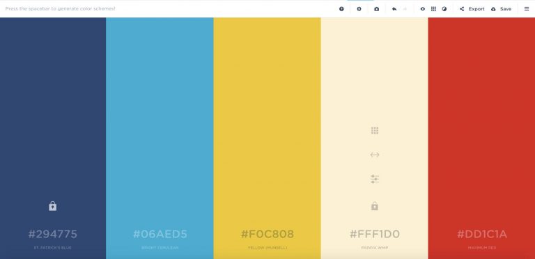
Focus on choosing a primary and secondary- accent- color. These colors should not only reflect your brand but also be complementary to each other. An amazing tool to source complementary color is Coolors. Start by ‘locking’ your primary color and allowing the tool to generate a plethora of complementary colors. Just remember- especially in the case of button color- you need to maintain appropriate contrast between the button background color and font color. A google example could be a background color of #B3D0E7 and a foreground color of #61082B, as seen on Dropbox.

Respecting User Intent
In the context of your shopping cart and checkout flow, you want to drive the user behavior of adding items to their cart and proceeding to checkout. And your users want to do the same! Making it easy for them to do so requires thinking about several items:
- Use clear, descriptive activity titles. Avoid confusion by limiting extraneous information in the title that could be placed in descriptive text.
- Your primary call-to-action button color should stand out from the page and elicit a sense of urgency (note: not panic). Avoid colors commonly associated with error states, danger, or disabled button states e.g. light greys, or jarring bright, saturated colors.
- Use link color to denote a clickable element. Precedent suggests a blue variant, but you’re able to use most colors (again, don’t use jarring bright, saturated colors or colors that imply disabled links). The key is to be consistent with your link color choice.
- Use colors that may evoke emotion. Determine who your users are and what feelings you hope to elicit. Specific colors have been known to trigger different emotions; for example, blue conjures feelings of safety, trust, and relaxation, while red can emote a sense of importance, danger, or passion.
Designing for Web Accessibility
To ensure your checkout flow is as accessible and inclusive as possible, it’s important to keep several factors in mind when customizing your color palette.
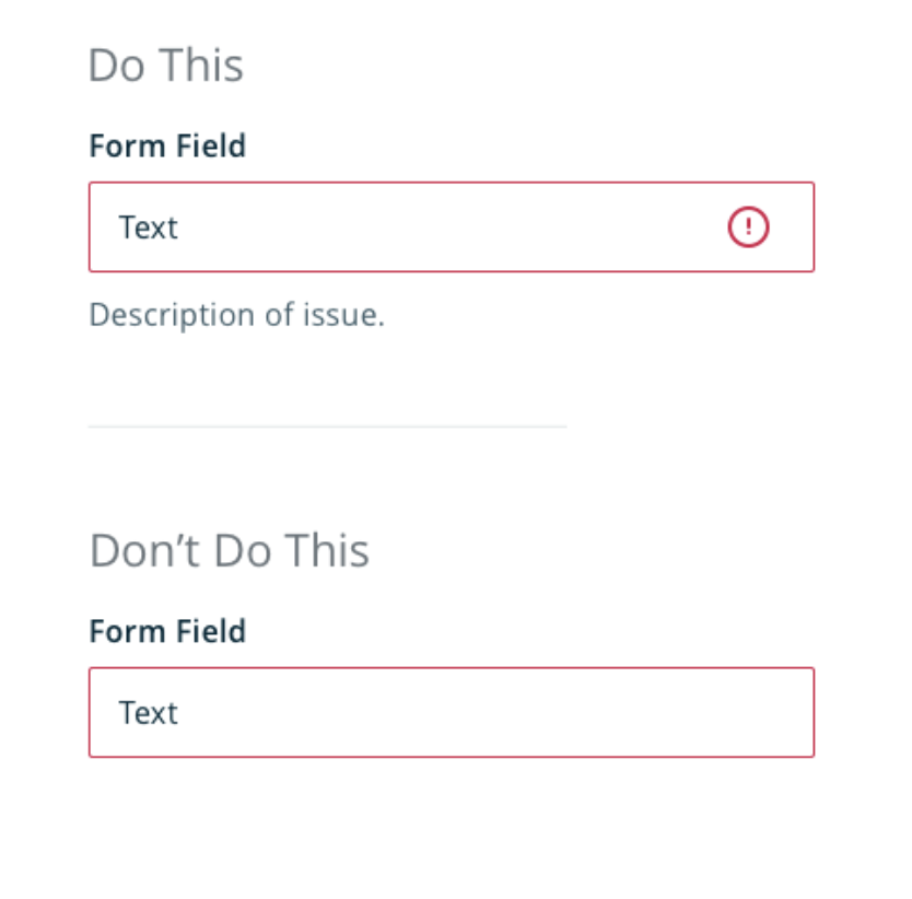
- Avoid using color as the only indication of what to do. Instead, use color only as a hint to the user.
- When creating buttons that call the user’s attention and require their direct interaction, avoid using color combos that are easily confused by color-blind users (i.e. red and green, or blue and yellow).
- Make sure that there is sufficient color contrast for all content. Web Content Accessibility Guidelines Level AAA requires a contrast ratio of at least 7:1 for normal text and 4.5:1 for large text. To verify your color choices, test them at Contrast Checker.

Color is a powerful ally and tool in interface design. Remember to create a well-balanced, visually appealing and accessible color scheme by thinking of the 60-30-10 rule. Pick out a prominent, neutral color for 60% of the scheme; a secondary, complementary color for 30% and an accent color to round out the overall design. Customizing your colors in Camp and Class Manager will delight your customers, help highlight your brand and generate a great user experience.
Edited by Ashley Henry, Sr. User Researcher


